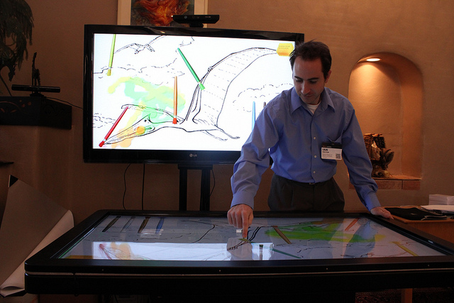
Designing a multitouch exhibit for 2-6 year-olds with Ian Holtum

Ian Holtum is a Multimedia and Technology Developer for the Denver Museum of Nature & Science. Mr. Holtum noted that his background is in development and marketing – for kids. He spoke at the 2011 Open Exhibits Summit about designing a multitouch exhibit for 2- to 6-year-olds.
“We wanted to allow the kids to use the same skills for actual painting on the digital table,” said Mr. Holtum. So he and his team spent one week building a prototype table. The museum was already using multitouch tables and wanted to see how the technology would work in their new spaces. As with any new technology, there were challenges to overcome.
After thirty days of observing the prototype table in use, the designers noticed that parents showed the kids the basics of the table, the kids then learned advanced interactions on their own, and then they were better at using the table than their parents. The play was parallel and cooperative: girls enjoyed the social structure of the experience while the boys preferred the prescriptive nature of painting within the lines, telling others how to “paint” properly.
Mr. Holtum said he enjoyed what he called the “Oh, wow!” moments. “They [learn to interact] and it works,” said Mr. Holtum. “Then they would run off and tell their parents what they learned,” he added.
To see how effective the multitouch table was in recreating the actual experience of painting, an actual painting table was positioned directly next to the prototype digital table. “Kids love digital,” said Mr. Holtum, “They would start with the actual paint, then moved to the digital table,” he added. Somewhat surprisingly, the digital table was a more social experience than the actual paint table. “The digital table is novel, and there was the learning aspect to talk about,” said Mr. Holtum. He added that the actual painting was fun and easy for the kids, but it was the new experience of the digital table that really got them talking and interacting with each other.

By acknowledging and then addressing the challenges, Mr. Holtum and his colleagues learned some interesting things. He outlined the technological challenges of developing an exhibit for kids:
- Creating it as a multi-user table to allow a social experience
- Using digital brushes as an object to interact with the table
- Defining who controls elements of the table and when they control them
- Discerning deliberate actions from natural actions (an elbow or sleeve from a finger)
- Avoiding magical thinking, demystifying the technology used
These challenges went another level deeper regarding development:
- Flash gets slower and slower as the table is used, causing system crashes
- User position/table gestures, the table was too high for kids, resulting in unintentional gestures
- Capabilities of capacitive screens (can’t decipher touches of skin from clothing)
- Interface (people didn’t understand the options for brushes and paint colors)
- How to do persistent data – how to track objects, connecting them with visitors.
Mr. Holtum said most of the challenges were overcome. The Flash issue was solved using creative screen refresh techniques and the interface has been trimmed down to its most basic elements.
The final challenge of persistent data is the issue to solve, said Mr. Holtum. There’s no way to associate what’s happening on the multitouch table with a specific user. Mr. Holtum used the example of paint brushes. If a user puts one paint brush down to use another, the user has no continued connection to the brush. The table isn’t fully engaged with what the user is doing. Solving that is what Mr. Holtum sees as the ultimate goal for the best user experience. “That’s what’s really exciting about this stuff.”
Slides from Ian Holtum’s presentation can be viewed here:
by Donovan Kabalka ![]() on March 11, 2011
on March 11, 2011